Interactive and Mobile Design
Graphic design and UX/UI work for Verizon's in-store mobile device demos.

Our creative team at Invodo was tasked with building Verizon's in-store mobile device demo experiences. These demos ran on top of the default device OS, allowing us to guide and control the user's progression through the demo while building an engaging and enticing experience that flowed well and maintained brand identity throughout.

One of the most unique challenges we faced in the course of creating these experiences was that while our goal was, for the most part, to recreate as faithfully as possible the brand's device UI, style and elements we were not given access to any of the original UI elements so every menu and element had to be recreated from scratch. This was accomplished through a variety of means such as cutting up and compositing device screenshots, creating original content with illustrator and photoshop, and assembling all of these 'slices' within photoshop to act both as individual art boards for art directors/producers/clients and content-generating documents for when it was time to pass everything on to the developer. Photoshop's built-in asset generator was used extensively.

We would use popup info cards to call out specific features of the device and instruct users on how to interact with the controls. Minimalism and efficient instruction were key here, as we wanted to keep the experience as uninterrupted as possible and maintain audience engagement.

In this experience we were simulating the manual video mode of the device's camera, showcasing the level of control you have over all of the individual aspects of video recording and what their functions were. The UI was created entirely from scratch and layered over a stock video loop. Effects were implemented on the dev side with guidance from myself and the art director. We used small, timed popups here to guide a user from setting to setting, QA-ing the experience to determine a comfortable amount of time to allow for each setting to be explored.

In this demo we were guiding the user through the video editing capabilities of the device (a small tablet in this case). One of the challenges I ran into here was being tasked with recreating a landscape-only app in a portrait-oriented experience, while retaining as much of the original feel as possible. Here again I relied on device screenshots, slicing and rebuilding the UI to fit into a portrait orientation, small info popups, and embedded stock videos as sample clips for the user to play with.
Constraints such as this (set orientations or permanent top/bottom bars) were common client requests and required a healthy dose of creative problem-solving to design around.

To work around this I built a UI that was larger than the screen space and shifted the whole UI vertically and horizontally to accommodate the next feature or step as it was introduced. As the user navigated through the experience the screen would pan smoothly from one vignette of the UI to the next, maintaining spacial and visual context without crowding the screen with excessive information.
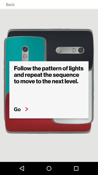
In addition to software features we were occasionally asked to highlight a physical aspect or accessory for the device; in this case multicolored, swappable phone backs. we decided to gamify the experience, pushing the client brief in scope and approach (at this point Verizon had traditionally only done app walkthroughs for their demo experiences).
After playing around with the physical phone backs for a bit we settled on a 'Simon' type experience that would highlight the range of colors available for customizing the phone while creating an engaging and visually interesting experience for the user.

Users were presented with a pre-set layout of phone backs, which would light up in a randomized sequence. Once the sequence finished the user would have to tap each phone back in proper order to move on to the next sequence. There were four 'levels' and each successive level had a more intricate layout with more phones and more light-up sequence steps to follow.

With each of the experiences upon successful completion the user is greeted by a congratulatory splash screen, wrapping up the demo with a call to action (an accessory purchase in this case) or more info on the device and features they just demoed.

For this device Verizon wanted to highlight the ruggedness of a phone that was designed to withstand a drop from up to 6 ft. Continuing our gamification of the experiences we created a 'flappy bird' clone, with the user dragging a balloon-hoisted phone around an infinitely-scrolling screen while attempting to dodge stationary objects like furniture and appliances and mobile attacks from dropping keys and flying sewing needles.
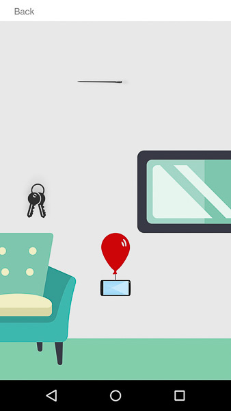
All visual design, style and layout was done by myself while working closely with our dev team as we worked out the specific quirks of making such an extensive experience run on our resource-limited OS shell. QA testing was utilized extensively to determine proper size and spacing of each element, retaining somewhat realistic proportions (we were actually told by the client's legal team to never let it appear that the phone dropped more than 6 feet, for liability reasons).
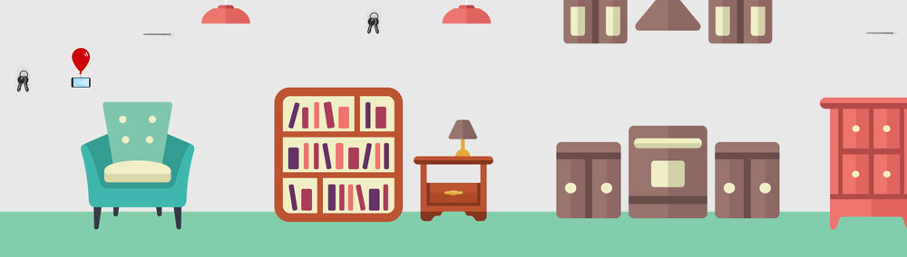
The background and object placement was done programmatically, with input from myself and occasionally the art director. Because we *wanted* the user to eventually fail (dropping the phone and triggering the end-of-experience info card) we gradually sped up the scrolling speed of the screen until it was virtually impossible to continue dodging objects.

This experience was designed to highlight a device's long battery life (supposedly over 24 hours with regular use), and was the most extensive and involved demo I built at Invodo. Battery life isn't a very intrinsically exciting or sexy idea to throw at the user, so we created an 'infinite runner' game to play around with the feature the client wanted to push; that the battery lasts 24 hours with typical use running games and usability apps.
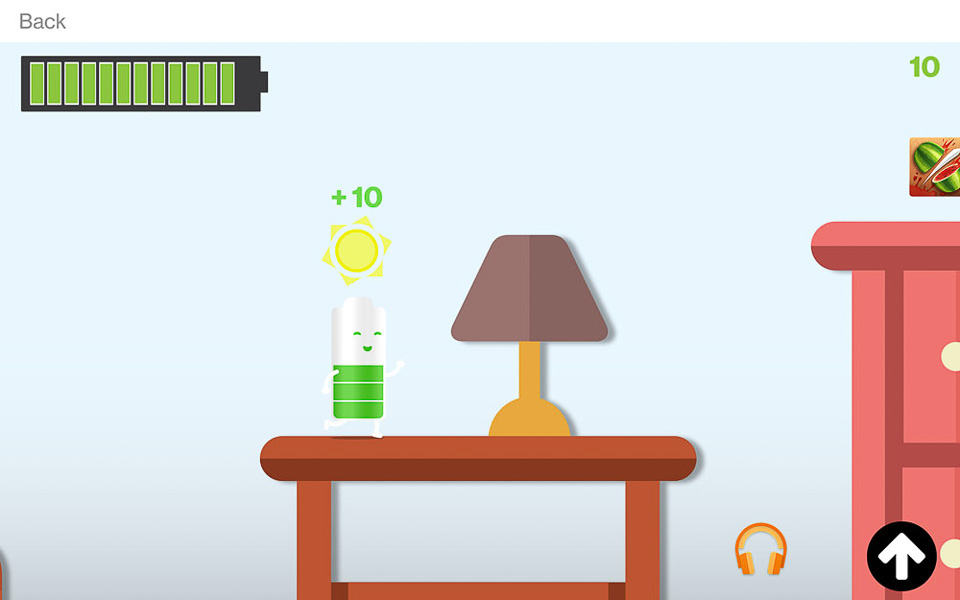
Battery Man (as we called him) would run forward at a set pace, with a jump button being the only user control. As the experience continued the battery bar at the top left would slowly drain, while the environment would eventually shift from day to night to day again, signifying a 24-hour time cycle. Grabbing app icons would garner the user points while contributing to the battery drain.
Through testing we managed to time the experience so that no matter how the user played good ol' Battery Man would make it back to his charging station home at the end of the 24 hours without running out of juice.


